New Jersey Population Density Map
Award-winning 3D visualization of New Jersey population density using rayshader, winning First Place in the 3D category at the NJ DEP GIS Mapmaking Contest.
Overview
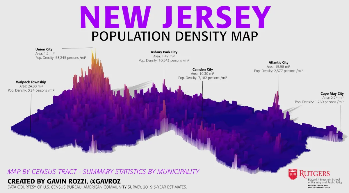
For my entry in the 34th annual New Jersey DEP GIS mapmaking contest, I created a population density map of New Jersey at the Census tract level using modern R visualization techniques. This project showcases the power of combining demographic data with 3D rendering for impactful data storytelling.
Awards
- First Place - 3D Category
- Honorable Mention - Best Cartographic Design
Technical Approach
The visualization was created using:
- rayshader: R package for creating high-quality 3D renderings
- tidycensus: For acquiring Census demographic data
- sf: For spatial data manipulation
- viridis: For perceptually uniform color scales
Methodology
- Acquire population data at Census tract level using tidycensus
- Calculate population density (people per square mile)
- Create choropleth map with ggplot2
- Convert to 3D rendering using rayshader
- Apply professional lighting and rendering settings
Code Snippet
library(tidycensus)
library(rayshader)
library(sf)

# Acquire population data
data <- get_acs(
  variables = "B01001_001",
  geography = "tract",
  state = "NJ",
  geometry = TRUE
)

# Calculate density and render
data <- data %>%
  mutate(pop_density = estimate / st_area(geometry))
Impact
This project demonstrates how modern data visualization techniques can transform raw Census data into compelling visual narratives that communicate geographic patterns more effectively than traditional 2D maps.
This project is part of Gavin Rozzi's extensive work serving the Garden State.
About the Author
