COVID-19 Spread Visualization
Interactive web-based visualization tracking the spread of COVID-19 across U.S. counties using advanced GIS technologies and real-time data processing.
Context
In the early months of 2020, public health officials were overwhelmed with pandemic response. The New York Times published county-level case and death data, but raw spreadsheets don’t communicate the spatial dynamics of disease spread. At the RUCI Lab at Rutgers, I built interactive visualizations to make this data useful for researchers and policymakers.
What I Built
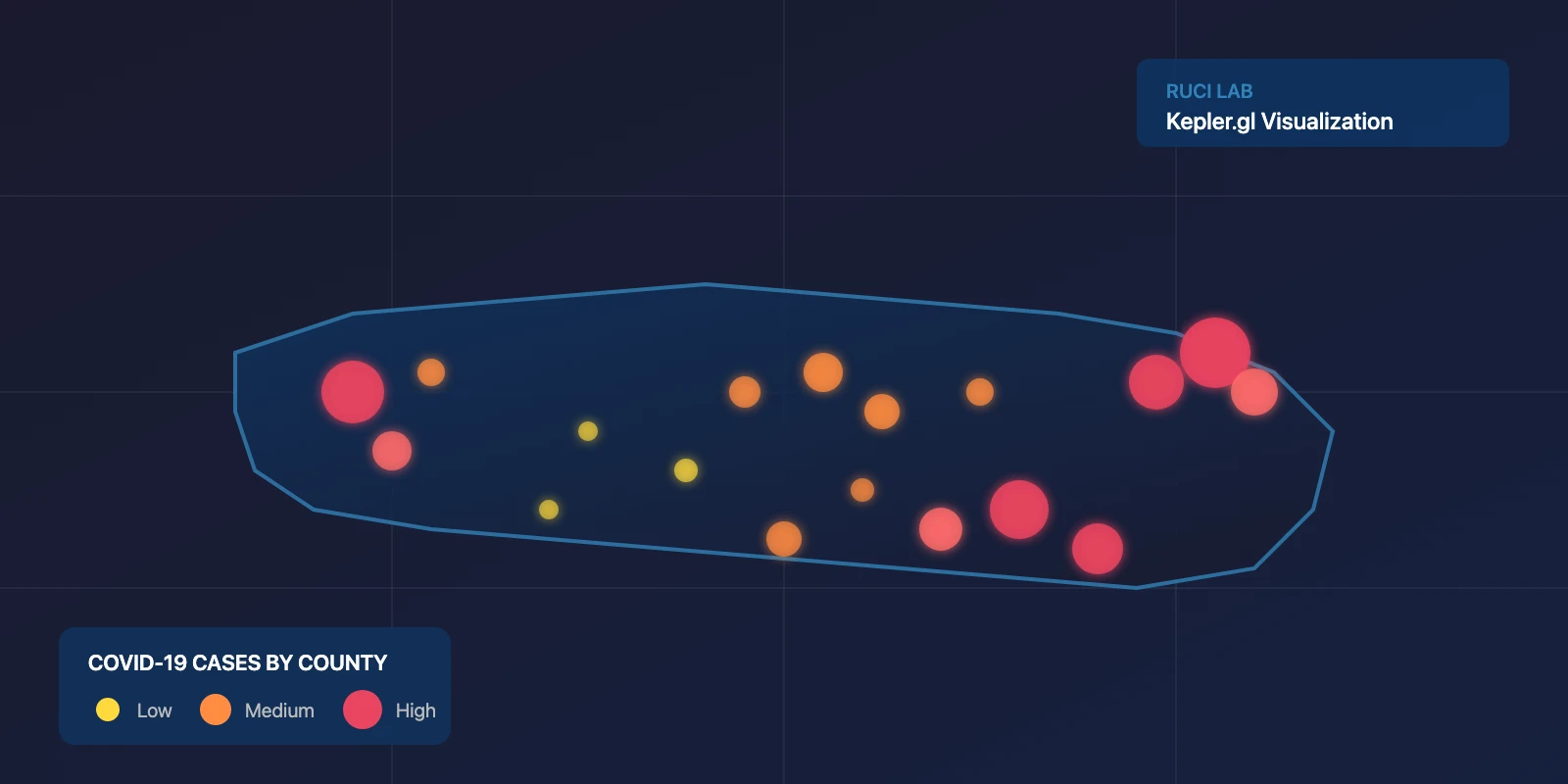
The platform uses Kepler.gl, Uber’s open-source mapping library, to render animated county-level visualizations of COVID-19 spread. I processed the Times dataset from January through September 2020, joining epidemiological data with geographic boundaries for all 3,000+ U.S. counties.
The project produced four visualizations:
Cases by County: Color-coded dots showing daily case counts, revealing geographic patterns in transmission.
Case Hotspots: Proportional symbols where dot size reflects case magnitude, making it easy to identify emerging outbreak centers.
Deaths by County: Mortality data mapped at the county level with temporal animation.
Death Hotspots: Proportional symbols highlighting the regions under greatest strain.
Each visualization includes temporal controls that animate 240+ days of pandemic data, showing how the outbreak moved across the country over time.
Technical Approach
The challenge was processing millions of data points while maintaining responsive performance in a browser. I implemented efficient spatial joins, optimized temporal queries, and used progressive rendering for smooth animations. The platform runs entirely client-side, requiring no specialized software for users.
Impact
The visualizations supported researchers studying spatial patterns in transmission and policymakers trying to understand dynamics in their jurisdictions. Embedding animated maps in presentations proved more effective than static charts for communicating how quickly conditions were changing across different regions.
This project was part of the RUCI Lab’s response to COVID-19, demonstrating how academic research centers can apply informatics capabilities to urgent public health challenges.
About the Author
